Did Covid-19 make the “City Nature Challenge” less green?
For his capstone project in the Wild Davis course, taught by CCS Faculty Fellow Laci Gerhart, Nicholas Monty explored spatial shifts in City Nature Challenge observation patterns between 2019 and 2020, using remote sensing measurements of relative “greenness.” We’re happy to share his fascinating approach here. Thank you Nicholas!
The City Nature Challenge (CNC) is an annual international event sponsored by the California Academy of Sciences and the LA County Museum of Natural History. Each year residents of a wide range of regions compete in classifying and recording the location of flora and fauna, generating a wealth of scientific data in the process. The 2020 CNC took place on the 4th weekend of April, the height of the coronavirus pandemic in the US. Shelter-in-place orders were in force along with the closure of many popular green spaces that are hot spots for CNC observations. Did Coronavirus result in fewer observations taken in green spaces?
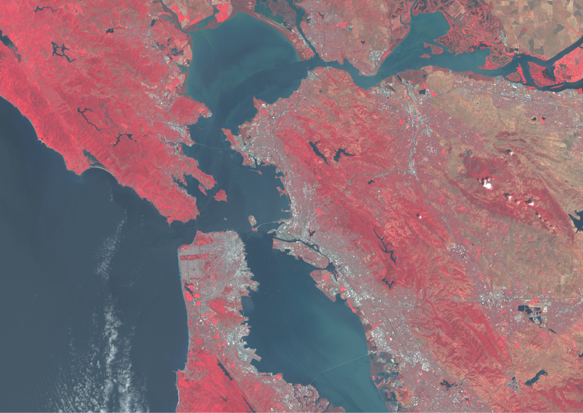
Two GIS techniques were used to test if this year’s CNC participation was affected: False Color Satellite Imagery (FCSI) and Normalized difference vegetation index (NDVI) or greeness.
Both False Color Satellite imagery and NDVI are created using satellite data imagery taken across spectral bands ranging from visible light, near infrared (NIR), infrared, to thermal. FCSI assigns colors to spectral bands that are not visible to the human eye. The band combination used is visible green, visible red, and NIR which were respectively colored (Green, blue, red). This false color image makes green vegetation appear red:
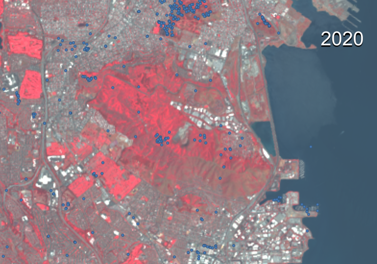
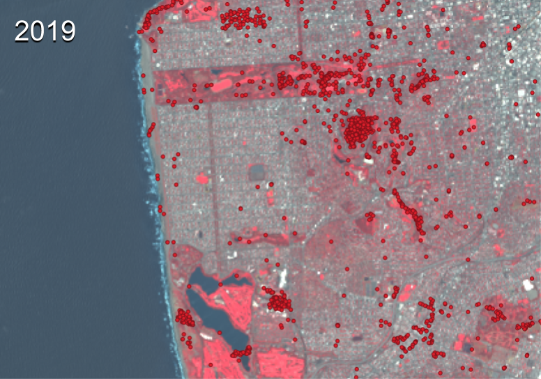
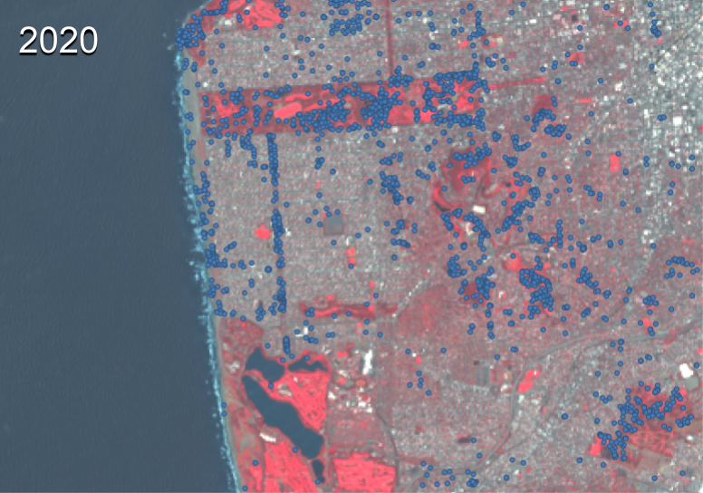
For example using FCSI, San Bruno Mountain State Park shows a year to year decrease in observations. The images below show the impact on the number and location of observations due to the park’s closure (2019 observations represented as red dots, and 2020 observations in blue):

On the other hand, a year on year increase in suburban area observations are shown in San Francisco’s Sunset, Forest Knolls, and Forest Hill neighborhoods.
While there are clear changes in distribution in some areas the false color images do not quantitatively show if the observations were taken in less green locations. The selected locations represent extremes in distribution changes which may distort the impact coronavirus has had on the CNC. In order to analyze the data with less bias a more quantitative approach is needed.
NDVI is a calculation based on Red and near IR band: NDVI=NIR-red/NIR+red. The formula creates a satellite picture that shows how much healthy vegetation is in a given area, in other words how green a location is. When assigned a color gradient it looks like this:
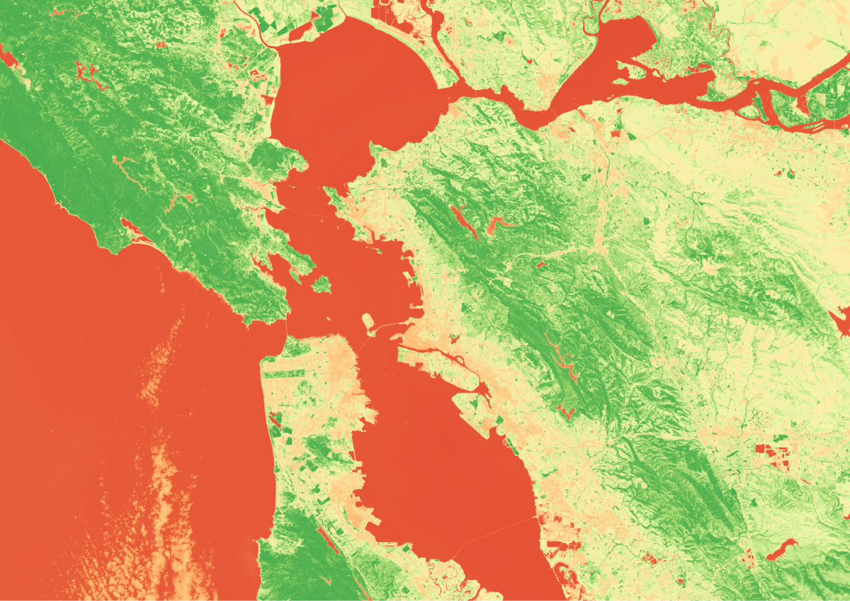
Each pixel of this photo is assigned a value between -1 and 1. Values close to -1 are red, while values close to 1 are green. Overlaying data points from the CNC onto the NDVI map allows values for each point to be calculated. Then the average NDVI of the location where an observation was made can be determined.
This NDVI procedure was repeated for the Sacramento region and San Diego region to yielding the following:
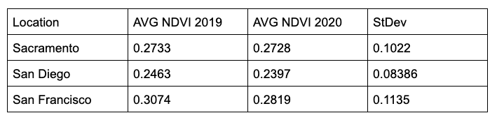
All of the results are within one standard deviation indicating that the NDVIs are not significantly different from 2019 to 2020. While it’s clear the two distributions are different, NDVI does not show that Covid had an effect on the level of greenery in the observed locations. This result may be due to areas that are greener, are generally less populated and visited less, with the exception of some urban green spaces. NDVI can also act as a heat map of population density, yielding an average NDVI showing where the population is most active. Overall 2019’s observations do not seem significantly more green than 2020s.